VSCO Interactive Redesign
In an introductory UI/UX course, I selected VSCO and reimagined its front page as an interactive showcase of its creative tools. This project focused on how motion and responsiveness can introduce features in a more engaging and intuitive way.
The final animation highlights interactive moments across the landing experience: photos subtly bounce upward on hover to suggest depth and tactility, filters preview dynamically to demonstrate their visual impact, and buttons respond fluidly to cursor interaction to reinforce usability and feedback.
Built entirely in Figma using components, variants, variables, and prototyping tools, the project explores how microinteractions on a single screen can communicate functionality, personality, and brand value before a user even begins creating.
Process
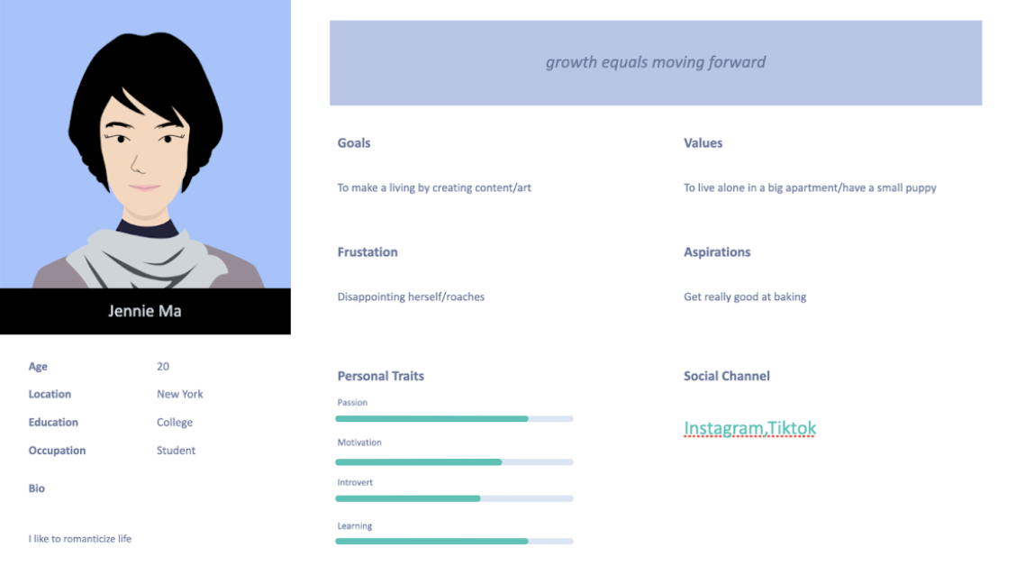
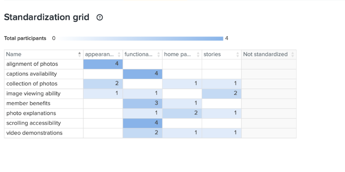
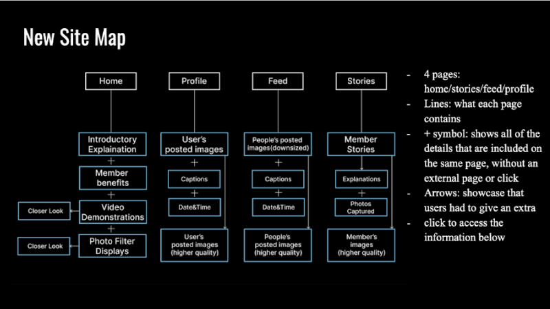
Grounded in UX research and a usability survey, I identified gaps in functionality, hierarchy, and content clarity. I developed multiple wireframes and conducted a card sort exercise to understand how users prioritize features like image viewing, captions, and collections. Insights revealed a need for stronger functional clarity and more intuitive content structure.
Subtle microinteractions—such as hover-based motion, dynamic filter previews, and responsive feedback—help communicate functionality while reinforcing VSCO’s minimal aesthetic. This project demonstrates a research-driven, systems-oriented approach to product design—where storytelling, interaction, and structure work together to create a more intuitive and engaging user experience.
© Concept project. VSCO is referenced for non-commercial, educational purposes.